Can independent authors really produce a book cover design to compete with the art departments of mainstream publishing houses?
The answer to that question is, yes - sort of - but authors need to take charge and do their homework. Publishers use expert teams to design their covers. Self-publishers need to emulate professional processes and design their front cover, spine and back cover as a complete package. They also need to be aware of the limitations imposed by ebook publishing and print-on-demand.

Don't leave the cover design to the last minute
Think about your cover as your story develops. Start to collect links to images that you like and build up a 'scrap book' of ideas. This not only helps to formulate designs in your mind but if you do ever seek help to produce a cover, the concept information is ready to go.
Don't Skimp On Your Photo(s)
If you're using a photo make sure that it's professional quality and that you have commissioned it. Professional quality doesn't mean professional prices. There are many amateur photography clubs who would love to do pictures for free in exchange for a credit.
Take Advantage Of Your Friends
But not drunk, obviously! Let's face it, it's not like you need a book cover every week- you'll be lucky if you need one a year! Chances are you know someone already who is better at graphics than you. Ask friends and sound people out. A cover produced with even a basic understanding of Adobe illustrator and photoshop will look a million times better than someone using a word processor package. Or...
Learn Adobe - We say Again, Learn Adobe!
Learn how to use a design package like Adobe in order to produce the cover yourself. Yes it's a long-term strategy but if your books take a year or two to write it's easily achievable. There are loads of short-term college / night-school courses that are less than £100. There are also countless you-tube tutorials to walk you through the process. Don't forget you'll also need a lot of promo stuff and web-content so if you can produce the material yourself, it will keep the costs down - Ka-ching!
The cover below was created in Adobe Illustrator in less than 15 minutes. Watch Tutorial.

Pinch Ideas From Mainstream Book Covers
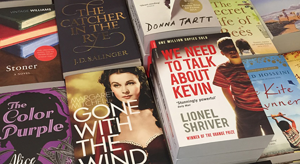
Err, sorry. Study the competition. Spend time in book shops and get a feel for cover designs in the genre you're writing in. Also - ignore genre and look for any artwork that you think reflects your style. Mash things up. If you're doing your own art then - defacto - you're an artist! So express yourself.
Develop An Eye For Seeing How Books Are Made
Find a published book you like and give some thought to the process that the illustrator and publisher may have used to create it. It's important that you understand the limitations of self-publisining or print on demand compared to mainstream methods. For example, with POD you will only be able to specify matt and gloss finish and, although you can use colour, you can't emboss or embellish with say... a gold lief effect. You need to be able to spot the type of embellishment used in the covers you like. This is difficult at first if you're not a designer but here are some quick pointers to look out for:
- Is the main cover a photo or artwork.
- Does it look like a stock image or one specifically commissioned*.
- Is the text flat or is there a drop shadow behind it.
- Is it a single image (photo) a composite of several images.
- Is the book cover composed of different layers, embossed, inlaid etc.
- Are the inside facing pages of the cover illustrated or blank.
- Is the book cover matt or gloss.
- What size is the actual book and how many pages are there. This will get more important when you know the number of pages of your own book but the greater the number of pages, the more the spine art will become important.
- How does the front cover art transition on to the spine art and then, in turn, onto the back cover.
- Does the cover have reviews or quotes etc.
Stock Images Can Save You A Load of Hassle but...
*The point above (Point 2) regarding 'stock images' is worth explaining in more depth. You can buy various images from stock websites such as alma, adobe stock and stocksy or get free images from sites such as unsplash.com but they do, of course, have limitations. For example, if you're writing science fiction or historical fiction it's unlikely you will find something that articulates perfectly what your book is about. Prices for stock images range from under $10 for use with ebooks and blogs etc. to $100 for paperback and mass distribution. Also - whatever image you take from a stock website always check the license agreement carefully and make sure it can be used in printed media and not just digital - some sites are very specific.
What's It Really About?
Distill your story down into themes or objects that represent those themes. For example, if you are doing a romantic novel set in France, rather than a photograph of a couple embracing in front of the Eiffel Tower, why not use a heart on a plain background. You might want to incorporate the country's flag colours into the heart etc. Try not to over complicate the cover with everything that's in the story - this if often the case for action genre novels that are crammed with scenes like someone jumping from a pair of crashing helicopters etc etc. Set the tone, theme and genre then move on. It's always nice to see some breathing space too.
Sell Don't Tell - If You Want It To Sell
Remember that marketing is not about 'telling your story' it's about 'selling your story'. All you want someone to do is take the book off the shelf (metaphorically). Once that's happened, it's over to the back cover to clinch the deal with a killer slug-line and hopefully some 5 star reviews or quotes. Job Done!
Keep Your Options Open
Don't settle on one design straight away. Even if you think it's very professional. Do a few options and test people on what best represents your story. A shop window has to represent what's on sale in the shop. No matter how good your cover looks, it has to accurately sell the story.

Watch our video on cover design and also how to create a 3D cover

'William Peel is a brilliant character, an aristocratic buffoon– so wealthy he is beyond reproach, and lacking any self awareness, he makes for a superbly comic protagonist. This is a brilliant example of the historical comedy genre.'
Harper Collins


'A conversation with William Peel is like being stabbed in the head with a blunt knife covered in goat excrement'
The Prince Regent, 1814
'It’s a failing of the common man that he mistakes arrogance for simply the behaviour of his betters'
William Peel, Lord of Tornbridge

